
Leafing through the pages of this old favourite I found that most of the illustrations, whether for an inspiring article on room design or a garden; for newly invented products such as 'Alkathene' kitchen ware ('Light as a feather, never rusts, cleans at a wipe') or for house cleaning were in black and white or sepia. Oh... so many, many products for and instructions to women on how to clean, what to clean, when to clean, and which mop/brush/sponge or cloth to use. Many of the fabrics, furniture, room settings and gardens would be instantly popular today and tagged with the word 'Vintage'.
Only a few adverts stood out in colour. These included famous brands: K shoes, Redland Tiles, Brooke Bond Tea and Spode!

The Spode logo is beginning to look more like the one which became famous in the late 20th century but still not fully evolved. The marketing blurb is trying to sell history and modernity; affordability and class. And as usual the Josiah Spode is not identified so all three of the famous Spodes with the same name are merged into one.
The pattern on the silver tea tray is Chinese Rose - note the biscuits - you can still buy the same ones today. The pattern was in production from about 1913 to 2007. It was printed and then handcoloured when it was first introduced and this continued for many years. By the end of the 20th century it was decorated by 'water slide' (lithography). The quality was high with the brush strokes from the handpainted version repeated in the litho. For more on this pattern go to Spode and Chinese Rose and the C page on my Spode ABC.
The other patterns featured are clockwise from top left: Olympus, (on a two-tone body), Audley, Jacinth (on Flemish Green body) and Gainsborough.
 |
| Olympus pattern (detail) |
 |
| Audley 1938 catalogue |
 |
| Jacinth on Flemish Green body |
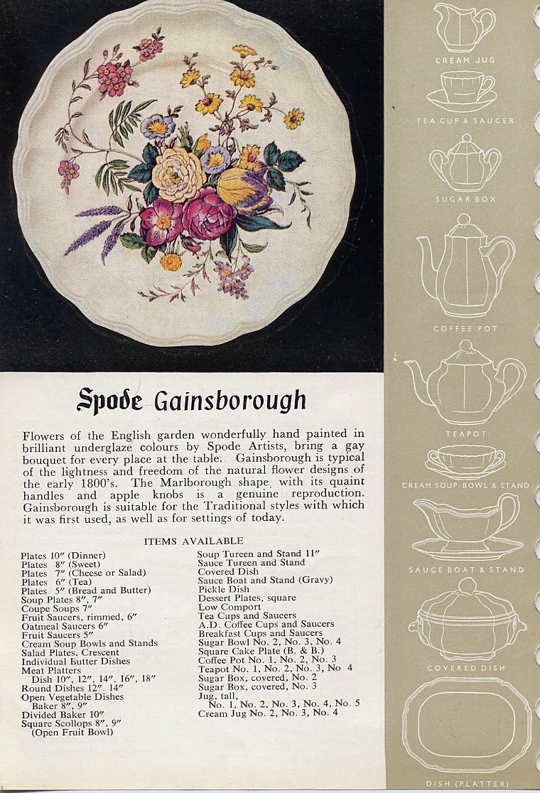 |
| Gainsborough 1961 catalogue |
To get a feel of the fifties here are a couple more images from the magazine:
 |
| Confused about brushes? |
 |
| Nothing better than a genuine Woolliscroft! |